(Kimberly (she/her) took the express train down the fountain pen/stationery rabbit hole and doesn't want to be rescued. She can be found on Instagram @allthehobbies because there really are many, many hobbies!.)
Perpanep is a line of 3 notebooks that Kokuyo launched a few years ago. The name Perpanep is a mashup of the words “pen” and “paper”. The papers used for the Perpanep are named Tsurutsuru, Sarasara and Zarazara. Each of these papers have a different texture, more on that in a bit. In addition, these A5 notebooks are offered in 4mm dot grid, 5mm grid and 6mm steno, which is a lined ruling that has a single vertical line through the middle of the page. For this review, I only have the 4mm dot and 5mm grid.

Set of 3 Perpanep Notebooks.
Each notebook comes with 60 unnumbered sheets/120 pages of paper. The notebook has a gray, flexible cardstock cover, and cloth binding tape which allows the notebooks to lay flat. Without the plastic “cover”, there is no decoration, branding or labeling, other than the small icon at the bottom center of the front, which indicates which type of notebook it is. There are 3 parts to that icon - a straight line, a slight wave and zig zags. This is meant to show the paper’s texture - smooth, slight texture, and more texture, respectively. The part of the icon that is in solid white tells you which paper is inside. I kept the thin plastic cover on the notebooks to remind me of the names of the different papers.

Thank goodness for these labels so I could remember which was which! It took me a while to realize that the diagonal lines echo the texture of the paper.
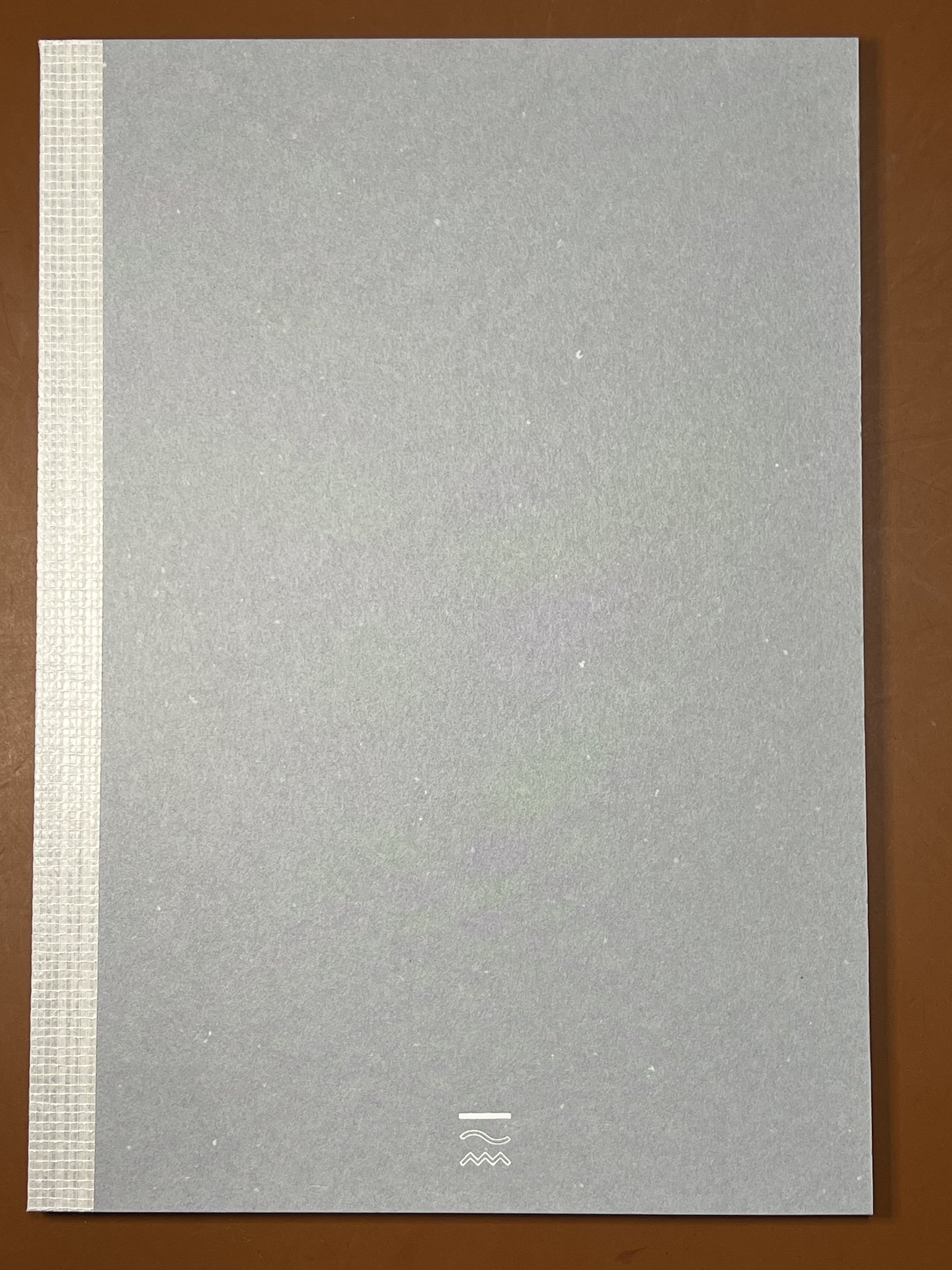
Just the icon at the bottom, which helps you figure out which notebook you have (this one is Tsurutsuru, which has the solid white line on the top part of the icon.)

The notebook’s binding allows it to lay flat when open.
Rather than writing with 48 inked pens, I picked the following pens for writing samples because of their nibs (stub, architect, flex, broad, etc.) or inks (shimmer, sheen, shading). I also picked a sampling of standard pens/markers that I’ve used for index card and similar reviews.

Fountain pens used: Leonardo Momento Zero (Medium), TWSBI 580 ALR (1.1), Pelikan M605 (Spencerian grind - extra extra fine with added flex), Esterbrook Estie (Broad), Leonardo Momento Zero (Fine Cursive Italic Flex from Stylosuite), Montegrappa Mia (Medium Monoc), TWSBI Go (1.1), Leonardo Momento Zero (Medium Architect), Franklin-Christoph 20, 14kt gold BB SIG), Scribo Piuma (Broad flex), Lamy AL-Star (Medium), Sailor Realto (Medium Fine.)
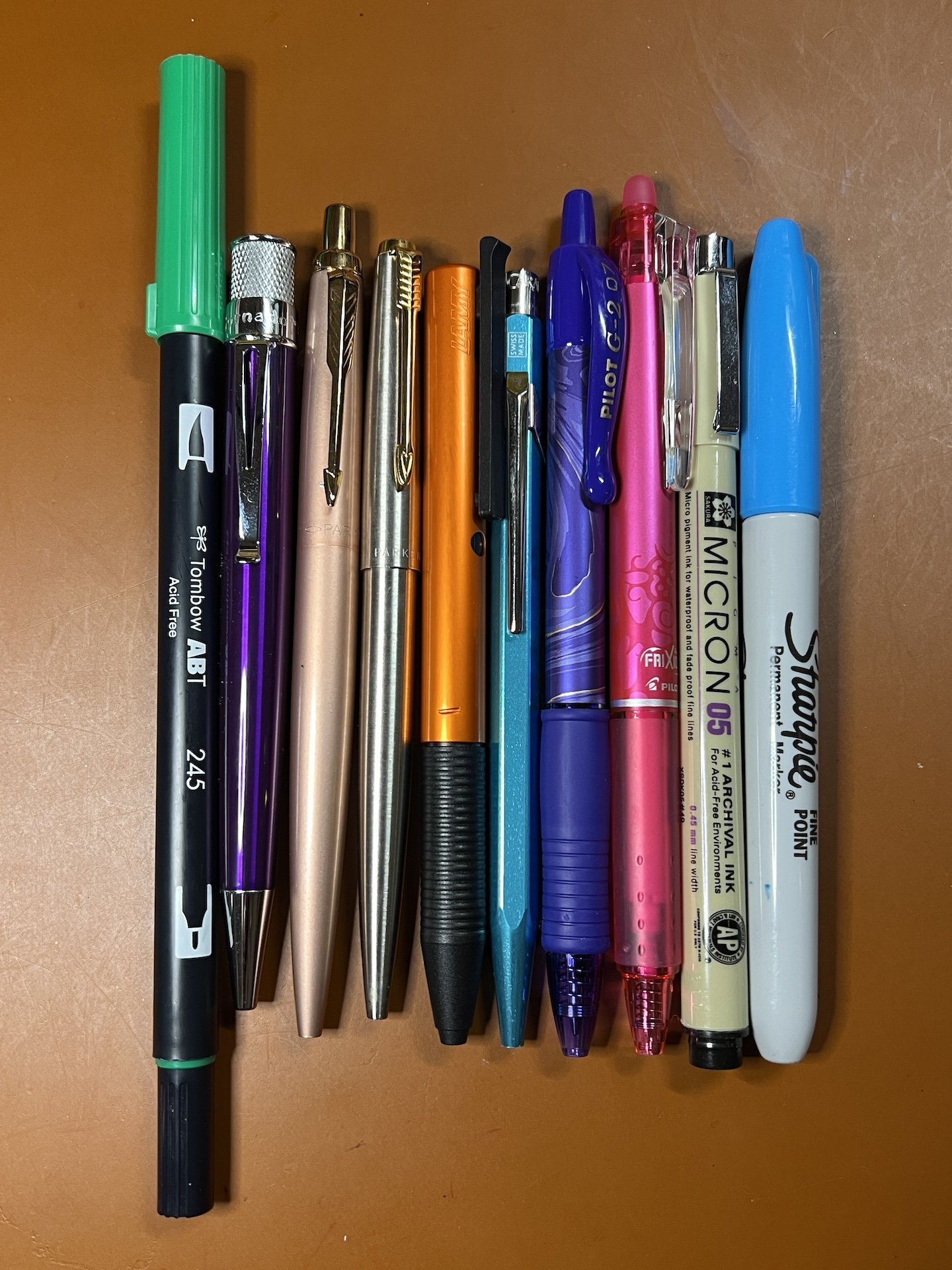
Standard pens/markers used: Tombow ABT Marker (color 245), Retro 51 rollerball, Parker Jotter XL with ballpoint refill, Parker Flighter with 0.7 gel refill, Lamy Tipo, Caran d’Ache ballpoint, Pilot G-2 0.7, Pilot Frixion 0.7, Sakura Micron 05 and Sharpie Fine Point.
Tsurutsuru is the smoothest of the 3 papers and has a slight ivory hue to it. Nibs just glided on them like butter on a hot pan. It was quite pleasant to write on, if you like really smooth paper. It held up to almost every fountain pen ink, except one - De Atramentis Document Turquoise, which isn’t surprising since most DA inks are fairly wet. It showed off shimmer, sheen and shading well. I generally prefer smoother to textured papers, so while this was nice to write on, but it might be a wee bit too slick. It felt a bit more smooth than Rhodia 80gsm or Clairefontaine 90 gsm paper. I don’t really have problems with sweaty hands or hand oils when writing but this might be one of those papers that could be affected by that, so your mileage may vary (or use a blotter sheet under your hand).
Note: Writing samples were used on the back pages of the notebooks so I can still use them from front to back when I’m done with testing it.

Writing samples on Perpanep Tsurutsuru - I don’t know why I wrote so big, lol.

De Atramentis Document Turquoise, used on the top line, bled through. No major ghosting and no bleedthrough with the other pens/inks.

Writing samples continued, along with some more normal sized writing.

No ghosting or bleedthrough on the back of the second page.

Lamy Dark Lilac 2024’s green sheen. I swiped it after it was dry and there was no smearing either.

Writing samples from standard pens and markers.

Is anyone surprised that the Sharpie almost bled through? There is some ghosting with the Retro 51 and Lamy Tipo, but overall the paper handled all the other pens just fine.
Next up is Sarasara, which was actually the first notebook I used because I hadn’t yet figured out the icon’s and what they meant, so I used all of the pens I had initially picked out (minus the Scribo which I added partway). Sarasara is a fairly smooth paper, but has just a wee bit of texture to it. It was very nice writing on it. I didn’t feel like my nibs were sliding all over the place. Like the Tsurutsuru, the only problematic inks/pens were the De Atramentis Document Turquoise and the Sharpie.
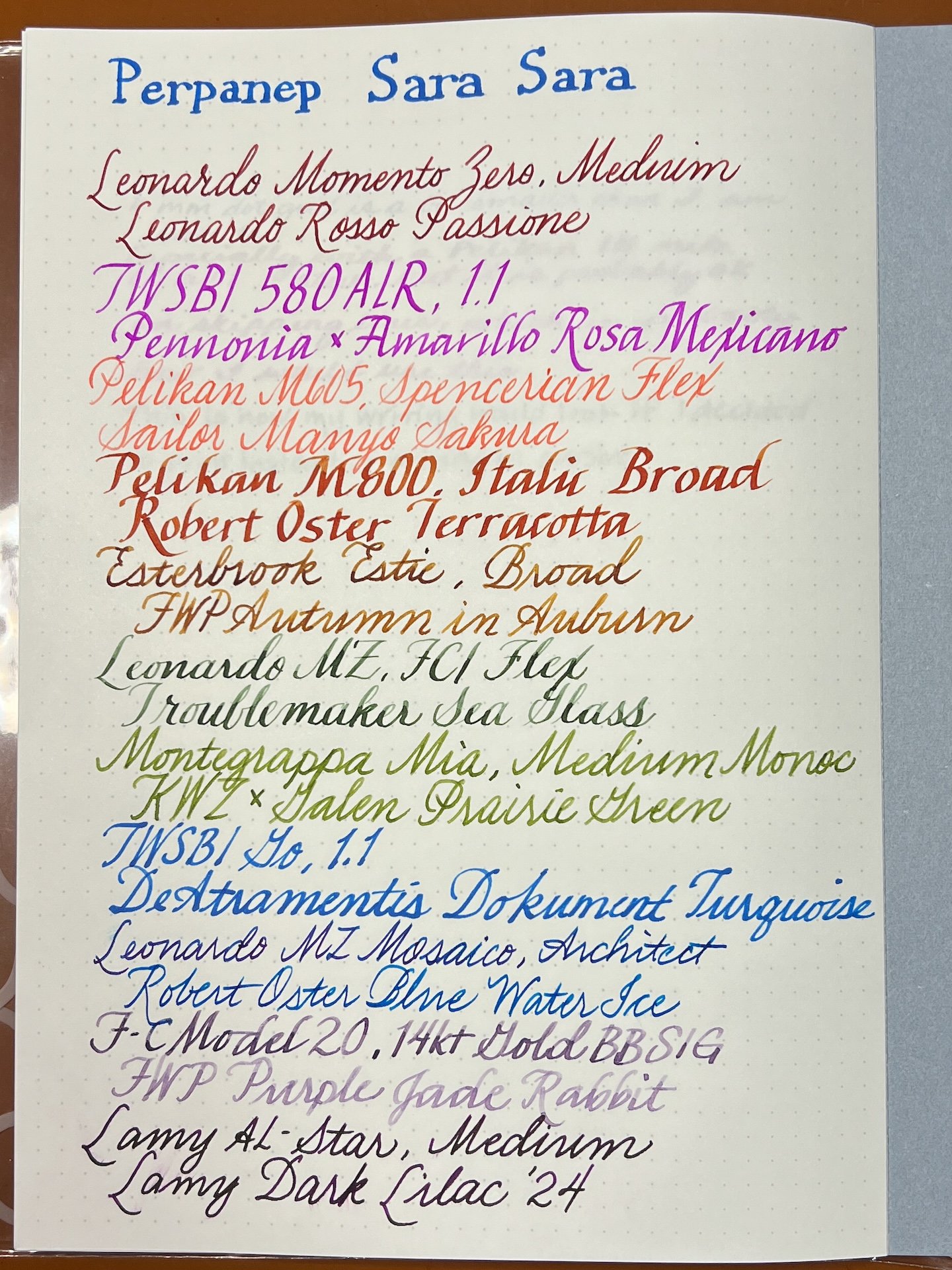
Sarasara writing sample.
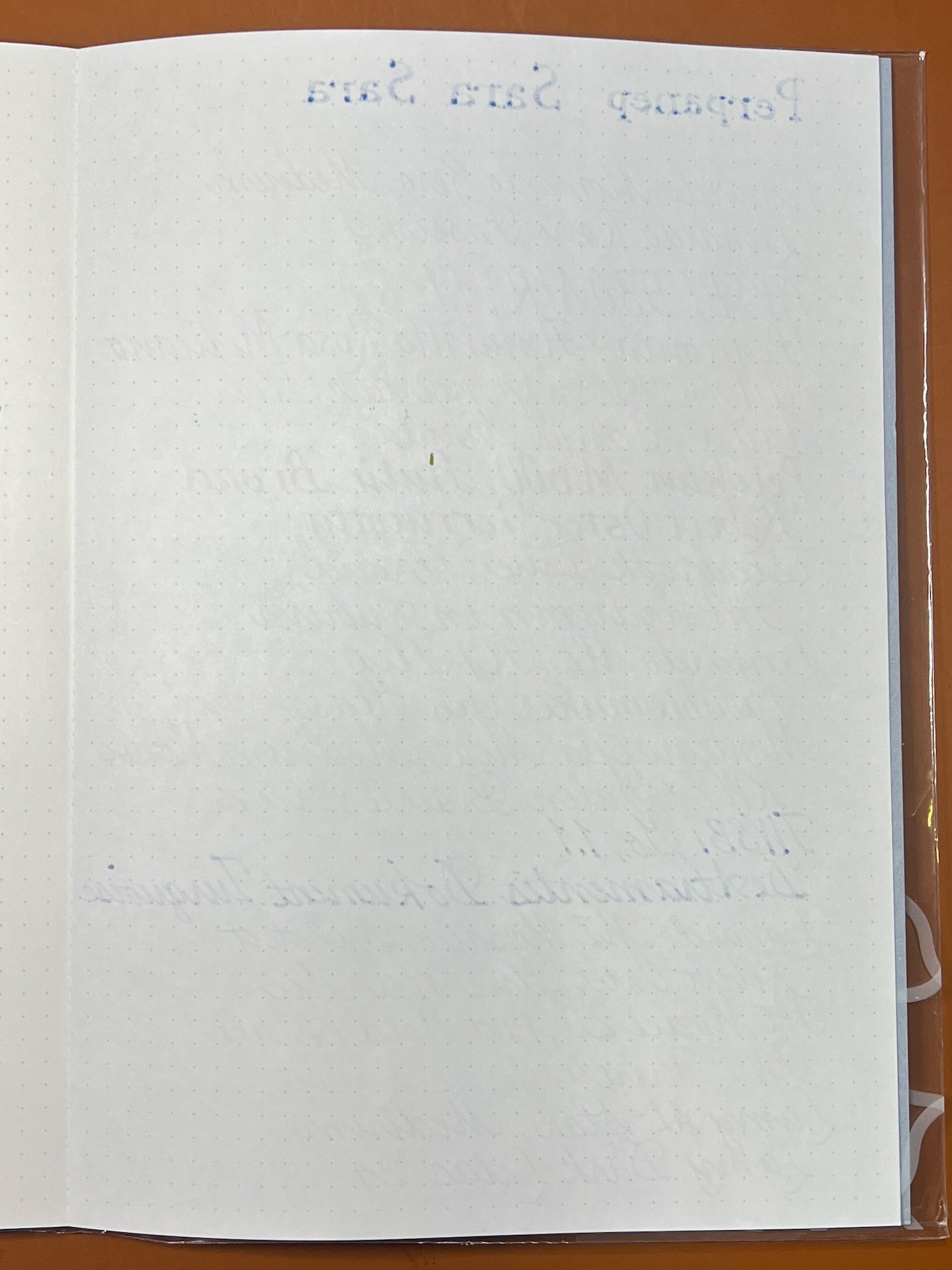
You can see the bit of bleedthrough from the DA ink at the top and in the bottom ⅓ of the page. The speck of ink near the middle was because I accidentally closed the notebook before the left side had fully dried.

Not quite so gigantic writing on Sarasara.

Again, no major ghosting or bleedthrough.

Lamy Dark Lilac 2024’s greensheen is there but not quite as visible as with Tsurutsuru. The smudge was made before the ink was fully dry.

Everything wrote fine. The ballpoints had just a wee bit of a hard start but it was barely noticeable in the Caran d’Ache.
About the same amount of bleedthrough from the Sharpie on Sarasara as Tsurutsuru.
And lastly we have Zarazara. This was the most textured by far and I knew going into it that I would likely be biased against it because I do have a preference for smoother papers. But I tried my best to be objective and give it a fair shake. Zarazara isn’t just more textured, it’s also a bit more absorbent. The De Atramentis practically wicked itself out of the nib and into the paper. I wondered if the Extra extra fine Spencerian flex would catch on the paper but it did not. In fact none of the pens felt bad on the paper. The paper feels dry, as opposed to slick like the Tsurutsuru. It held up well to fountain pens, but it’s my least favorite of the three.

As soon as I started writing “Perpanep” on the Zarazara, I could see the ink soaking in like a sponge. After a few lines, I had a hunch it would still be fp-friendly, so I trimmed down the number of pens to cover shade, sheen and shimmer.

DA strikes again!

I kept expecting to see feathering but other than the De Atramentis, I didn’t really get that in large or small writing.

Looks good back here!

Even though the paper was able to show shading, sheen and shimmer, it felt like those various properties were a bit subdued, like it was absorbed into the paper. LDL ‘24 is still sheening bright green, just not as much as on the other two papers and it didn’t look quite a metallic.

The rougher texture of Zarazara gave the ballpoints a bit of a hard start but it was fine overall.

Sharpie bleeds through to the backside, as expected.
A few things to note that apply to all of the Perpanep notebooks:
- Minimalist aesthetic - While I appreciate the simplicity of the gray cover and the cleverness of the icon to indicate the paper, it isn’t my personal style, so I would likely cover it up with stickers or put a cover on it. It would have been nice to have different colored covers to distinguish the different notebooks.
- No page numbers - I am used to notebooks and planners that have page numbers but it’s not a big deal breaker for me.
- Pages not easily removed (this is a good thing) - I was a little skeptical of the cloth tape binding and whether paper would get detached easily, so I opened it up to the middle and tried to pull out some pages and was not able to do so. Keep in mind that I haven’t put the notebooks through any rigorous, long-term use, but it did hold up to a few solid tugs.
- Nothing to keep the notebook closed - This version of the Perpanep notebook does not have an elastic or anything else to keep the notebook closed. There is a premium version which has more pages and an elastic closure.
Overall, the paper in all three notebooks behaved well with the exception of Sharpie and a super wet De Atramentis document ink (it’s unclear if other DA inks would behave similarly or if there’s something in their document series that might cause this). My favorite of the three notebooks is Sarasara because it is very smooth with just a bare hint of texture, followed by Tsurutsuru which was very slick. Zarazara was my least favorite but it wasn’t a bad paper by any stretch. It wasn’t unpleasant to use, none of my finer nibs caught on the texture. Zarazara would be good for someone who enjoys paper like MD Cotton and prefers more tooth to their paper.
The Perpanep notebooks are available for $14.25 each from JetPens, who provided these notebooks for review.
(JetPens provided this product at no charge to The Pen Addict for review purposes.)